Fashion Color Trends 2026: Every Shade That Defined the Year
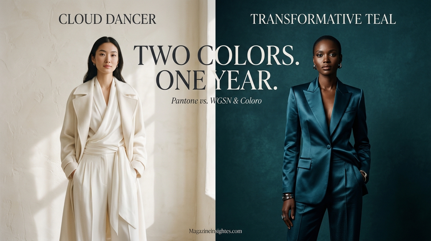
Fashion color trends 2026 were defined by a disagreement, since the two biggest color authorities named opposite shades and both turned out to be right.
Pantone chose a soft white, Cloud Dancer, while WGSN and Coloro chose a deep blue-green, Transformative Teal, and the year wore both.
This guide is a year-end verdict, not another forecast, comparing what the forecasters predicted with what the runways and stores actually delivered.
Every code, date, and figure carries its source, and conflicts between sources are shown openly instead of merged into one tidy claim.
Researched on November 18, 2026, from official releases, runway reporting, retail data, and color-specialist analysis.
No prices appear in this guide, since color advice outlasts any price tag, and every shade below is described by garment type, not by brand.
The Year in Color: What 2026 Actually Wore
The year opened with a quiet white and closed with deep, saturated color, and the shift from one mood to the other is the story of 2026.
Spring arrived in full technicolour, with butter yellow, powder blue, tomato red, and bubblegum pink sharing runways with soft neutrals.
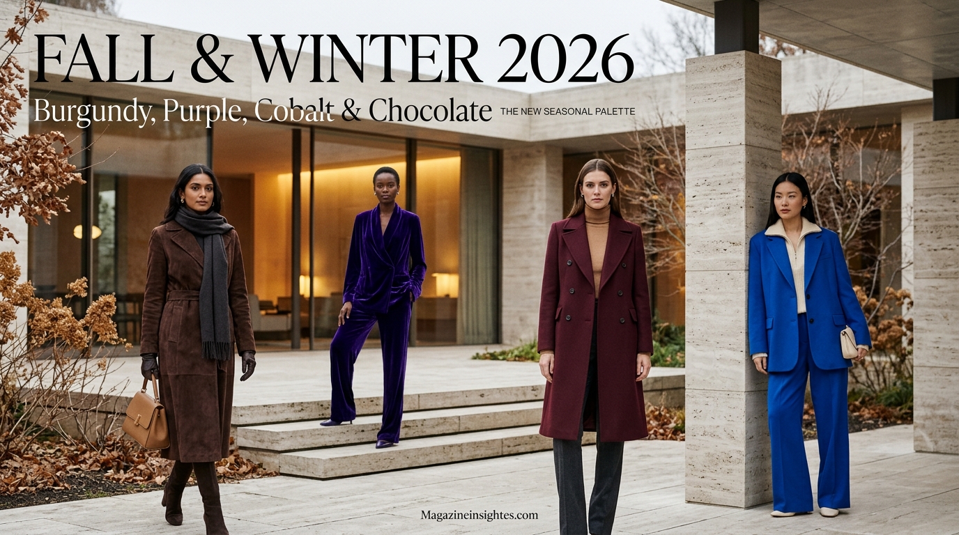
Fall went deeper and richer, with burgundy, royal purple, cobalt blue, and chocolate brown taking over as the season’s anchors.
Brown replaced black as the default neutral, white replaced stark white with soft off-whites, and red matured from bright cherry to deep bordeaux.
The table below gives the year-end verdict for each headline shade: predicted, delivered, or fizzled, with the evidence behind each call.
| Shade | Forecast | Verdict | Evidence |
|---|---|---|---|
| Cloud Dancer white | Pantone Color of the Year | Delivered as a neutral, not a star | Anchored monochrome looks; received coolly as a headline pick |
| Transformative Teal | WGSN and Coloro Color of the Year | Delivered as an alternative dark | Utility to occasion dressing; teal searches up 9% at announcement |
| Cobalt blue | Runway favorite | Delivered, both seasons | Prada, Valentino, Proenza Schouler; Vogue fall seven |
| Burgundy and bordeaux | Fall anchor | Delivered, dominant red | Trendalytics retail report; Vogue fall seven |
| Butter yellow | Spring pastel | Delivered, carried into fall | Prada SS26; Vogue fall seven; carried into cooler months |
| Chocolate brown | Emerging neutral | Delivered, new base | Deep brown searches up 50% year on year (Trendalytics) |
| Royal purple | Fall accent | Delivered, rising fast | Celine, Loewe, Mugler, Tory Burch, Balenciaga |
| Cherry red | Lead red of 2024-2025 | Matured to accent | Trendalytics: lingering accent, not the main story |
| Mocha mousse | Pantone 2025 pick | Carried over into 2026 | Momentum deep into 2026 per April 2026 analysis |
| Head-to-toe lemon | Runway statement | Fizzled for everyday wear | Flagged as a skip for everyday wardrobes in fall roundups |
The pattern behind the verdicts is simple: wearable shades with retail crossover won, while runway-only statements faded within weeks.
The Two Colors of the Year That Disagree
Two authorities, two opposite answers, and the disagreement itself tells readers more about 2026 than either pick alone.
Pantone: Cloud Dancer, a Soft White
Pantone named PANTONE 11-4201 Cloud Dancer its Color of the Year for 2026 on December 4, 2025, in Carlstadt, New Jersey.
The institute calls it “a billowy white imbued with a feeling of serenity,” a symbol of calm influence in a society rediscovering quiet reflection.
It is the first white Pantone has chosen since the Color of the Year program began in 1999, a 27-year first that surprised the design world.
Leatrice Eiseman, the institute’s executive director, speaks of “conscious simplification,” a stripping back of distractions to sharpen focus and free creativity.
Pantone calls Cloud Dancer a key structural color, a scaffold that lets every other color shine, whether worn in a button-down, T-shirt, jeans, activewear, or suiting.
The official announcement describes apparel, accessories, footwear, beauty, and partner collections, and the Pantone Cloud Dancer press release is the authority for the pick.
Partners for the year include Motorola, Play-Doh, and Joybird, with Cloud Dancer offered across hundreds of furniture silhouettes and limited-edition artist designs.
Pantone also released seven curated palettes around the shade: Powdered Pastels, Take a Break, Atmospheric, Comfort Zone, Tropic Tonalities, Light and Shadow, and Glamour and Gleam.
WGSN and Coloro: Transformative Teal, a Deep Blue-Green
WGSN and Coloro named Transformative Teal, Coloro code 092-37-14, their Colour of the Year for 2026, announced in September 2024.
They describe it as “a fluid fusion between dependable dark blue and aquatic green,” bridging the emotional benefits of green with the stability of blue.
WGSN frames 2026 as “a year of redirection,” when established ways of thinking are questioned and new approaches gain ground.
The shade signals transformation and adaptability, per WGSN, supporting regeneration while balancing clarity and emotional depth.
In fashion, Transformative Teal works as a gender-inclusive alternative dark, anchoring a look the way navy or charcoal would, with more personality.
WGSN’s autumn/winter 26/27 forecast recommends it as an alternative dark for the season, for clothing ranging from utility to occasion dressing.
At the announcement, WGSN reported Google searches for teal up 9 percent year on year, an early demand signal for the shade.
WGSN’s forecasts are used by more than 1,800 brands globally to plan product development two years ahead, per a B2B summary of the announcement.
Why Both Forecasters Can Be Right
Pantone answers a mood question, asking which single shade captures the cultural moment, and its answer was calm, clarity, and a fresh start.
WGSN and Coloro answer a product question, asking which shade brands should build collections around two years ahead, and their answer was a wearable dark.
A color of the year is a forecast and sometimes a marketing exercise, not a measurement, and different methods produce different answers.
Readers need both picks, since Cloud Dancer explains the year’s neutrals and Transformative Teal explains the year’s darks.
Every 2026 Color of the Year, Compared

Pantone and WGSN are not the only bodies naming a color of the year, and the full landscape shows a year split between calm neutrals and deep drama.
| Authority | 2026 pick | Code | Announced | What it is |
|---|---|---|---|---|
| Pantone | Cloud Dancer | 11-4201 | December 4, 2025 | Soft, airy, billowy white |
| WGSN + Coloro | Transformative Teal | 092-37-14 | September 2024 | Deep fusion of dark blue and aquatic green |
| Benjamin Moore | Silhouette | AF-655 | Fall 2025 | Rich espresso brown with charcoal notes |
| Sherwin-Williams | Universal Khaki | SW 6150 | Fall 2025 | Warm midtone neutral |
| Dulux UK | Rhythm of Blues | Trio | September 9, 2025 | Three blues: Mellow Flow, Free Groove, Slow Swing |
| Behr | Hidden Gem | N430-6A | Fall 2025 | Smoky jade green |
| IKEA | Rebel Pink | Not published | 2025 | Bold, confident pink |
| Valspar | Warm Eucalyptus | Not published | Fall 2025 | Soft, warm green |
| Farrow and Ball | India Yellow | Not published | Fall 2025 | Warm, rich yellow |
The pattern across the table is unmistakable: five bodies chose neutrals or near-neutrals, while the boldest picks, teal and pink, came from forecasters and retailers.
Paint picks matter to fashion readers because the same cultural mood drives both industries, and the brown and khaki picks echo fashion’s neutral shift.
A color-specialist comparison of all six headline bodies examines how each frames its choice, and the Karen Haller colour of the year analysis is the most careful reading of the narratives.
The Hex Problem: No Official Numbers Exist
None of the headline bodies publishes a hex value for its 2026 pick, and every hex circulating online is somebody’s approximation.
Cloud Dancer appears online as three different hexes, and Transformative Teal as two, because each approximation converts a physical pigment differently.
Pantone keeps its digital color values behind a Pantone Connect subscription, and paint companies say only a physical sample is authoritative.
A screen cannot show what a pigment does under a lamp, which is why codes are printed first and hex values second, if at all.
This guide prints codes, not hexes, for the headline picks, and labels any hex elsewhere as an approximation from its source.
Wrong Codes in Circulation, Corrected
A retailer page lists Cloud Dancer as 11-0602, which is wrong, and an Instagram graphic lists it as 17-4201, which is also wrong.
The correct code is PANTONE 11-4201, confirmed by Pantone’s own December 2025 announcement and by every careful secondary source.
A B2B blog lists Transformative Teal as 088-52-18, which conflicts with the 092-37-14 code given by the color-specialist analysis and the code-first COTY table.
This guide uses 092-37-14 with attribution and treats the other code as an error, since two sources agree on it and none corroborates the alternative.
One analysis contains a typo listing Sherwin-Williams Universal Khaki as SW 9101 in its body text, while its heading and four other sources give SW 6150.
The correct code is SW 6150, and the typo is noted here so readers who spot it elsewhere are not confused.
A code-first comparison of every 2026 announcement, with dates and the hex caveat, is published at the Color of the Year code table, a useful cross-check for any code in this guide.
Stale Pages That Name the Wrong Year
At least one widely indexed page still calls Mocha Mousse Pantone’s 2026 pick, when Mocha Mousse was the 2025 Color of the Year.
The same page names Cinnamon Slate as Benjamin Moore’s 2026 pick, when Cinnamon Slate was the 2025 pick and Silhouette is the 2026 pick.
Stale pages rank well because they are old, not because they are right, and readers should check the announcement date on any color-of-the-year claim.
Dulux regional picks also differ, since the UK chose the Rhythm of Blues trio while Dulux Canada chose Pine Forest, a deep green.
Never merge regional picks, since each market’s announcement stands on its own and the UK trio is the headline Dulux story.
Spring and Summer 2026: The Full Palettes
Spring and summer 2026 arrived in full technicolour, with runways leaning into brighter, louder color stories that felt joyful rather than garish.
Pantone’s seasonal reports set the framework, with separate palettes for New York and London Fashion Weeks, each reflecting its city’s designers.
Pantone NYFW Spring/Summer 2026: Ten Standouts, Six Seasonless Shades
The New York palette balances divergent colors for individual expression, mixing warm familiar shades with vibrant, stimulating colors and foundational tones.
| Standout color | Description | Seasonless shade | Description |
|---|---|---|---|
| Acacia | Green-infused yellow | Coffee Bean | Deeply roasted bold brown |
| Marina | Calming maritime blue | White Onyx | Off-white with ethereal reflections |
| Muskmelon | Sweetly fragrant orange | Rhodonite | Trusted blue hue |
| Alexandrite | Glamorous teal | Angora | Soft beige |
| Lava Falls | Dramatic red | Sycamore | Deep forest green |
| Dusty Rose | Veiled pink | Sage Green | Soft muted green |
| Tea Rose | Red-toned rose | ||
| Amaranth | Cosmopolitan purple hue | ||
| Burnt Sienna | Russet red | ||
| Burnished Lilac | Tinged, smoky lavender |
Reported Pantone codes include Burnished Lilac 15-1905, Lava Falls 18-1552, and Alexandrite 18-4835, per a trade summary of the official report.
Pantone associates the selection with honesty, authenticity, and the desire to express one’s own style, themes the institute repeats across its seasonal reports.
One AI-aggregated list of the same palette differs, swapping in Mandarin Orange, Tickled Pink, and Amethyst Orchid while dropping Dusty Rose and Tea Rose.
This guide follows the official list as reported from Pantone’s release, and treats the aggregated variant as unreliable.
Pantone LFW Spring/Summer 2026: Lilac Leads Both Cities
Burnished Lilac is the symbolic shade of the season, present in both the New York and London palettes, a smoky lavender with vintage charm.
Confirmed London names include Teaberry, a vibrant reddish rose, Pale Banana, a soft yellow pastel, Mandarin Orange, a fruity bright orange, and Caramel.
The London palette leans warmer and sweeter than New York’s, with the candied chestnut tone of Caramel balancing the theatrical Teaberry.
This guide lists only the confirmed London names, since the full London ten did not appear in the sources checked, and inventing the rest would mislead.
What the Spring Runways Actually Showed
Prada doubled down on butter yellow and powder blue, pairing the softest pastel yellow with a chalky blue that reads like old talc tins.
Gucci continued its love affair with tomato red, a non-mover in color trends that refuses to leave the runway conversation.
Saint Laurent went full 1980s Rive Gauche, with bold, polished color that anchored the season’s more expressive mood.
Bubblegum pink returned as fashion’s preferred serotonin hit, while army green arrived with its pop culture references fully intact.
Deep merlot, navy blue, barely-there nude, and tangerine rounded out the spring story, with Cloud Dancer offering light relief.
The spring season is covered in depth in spring 2026 fashion trends and in spring and summer 2026 fashion color trends, the dedicated color deep dive.
Summer’s lighter palette is covered separately in summer 2026 fashion trends, which follows the warm-weather styling of the same shades.
Fall and Winter 2026: The Full Palettes
Fall and winter 2026 went deeper, richer, and more saturated, trading spring’s pastels for jewel tones, edible browns, and confident monochrome.
Beige as a default is over, per fall runway analysis, replaced by rich, edible tones used as punctuation or as full monochrome moments.
Vogue’s Fall Seven Colors
Vogue’s fall 2026 color reporting highlights seven directions: electric blue, red, butter yellow, royal purple, burgundy, turquoise, and peach.
Royal purple appears at Celine, Loewe, Mugler, Tory Burch, and Balenciaga, the widest designer spread of any fall shade.
Cobalt blue appears in monochromatic combinations or alongside navy and gray, a high-impact statement that needs no partner color.
Peach, melon, and turquoise broaden the cold-weather story, bringing warmer and brighter notes to a season that usually goes dark.
Butter yellow carried into cooler months, an unusual crossover for a spring pastel, paired with camel, gray, and chocolate.
Red remains prominent across the season, while purple continues across several major collections, the two families sharing the spotlight.
The Retail Verdict: What Stores Actually Stocked
Trendalytics filtered 13 fall and winter trends for genuine retail crossover, cross-referencing New York, London, and Paris runways against retail sources and search signals.
Rich jewel-tone accents lead the retail list, with ruby red, vibrant purple, gold, and warm orange showing up independently across multiple sources.
Rich brown and cognac tones are the season’s base, with black losing ground to chocolate brown, cognac, and mocha as the default neutral.
Cherry red matured into a lingering accent, while deeper tones, bordeaux, oxblood, and true burgundy, took over as the season’s heavier-hitting red.
The full retail analysis, including regional US differences, is published in the Trendalytics fall and winter 2026-27 retail report, the strongest methodology in this topic.
Winter 2026: Brown, Burgundy, and a Hint of Purple
Deep brown became the season’s neutral, with camel, clay, and cream alongside, and burgundy and regal purple adding richness.
Deep brown searches rose 50 percent year on year, per Trendalytics figures as reported in a winter 2026 review, the strongest search signal of the season.
Soft brights keep the dark palette from feeling heavy: electric teal, butter yellow, ice blue, and silver appear as small accents.
Fabrics carry the color story in winter, with faux fur, bouclé, velvet, silk, and lace giving deep shades their tactile richness.
The fall season is covered in depth in fall 2026 fashion trends and fall winter fashion trends 2026, with the full-year women’s picture in 2026 fashion trends for women.
The Neutrals: Brown, White, and the New Black
Neutrals were the biggest story of 2026, since the year’s most consequential shift was not a bright shade but a change in the base colors.
Chocolate Brown: The New Base
Chocolate brown, cognac, mocha, and toffee formed the warm neutral family that replaced black as the default across coats, boots, and tailoring.
Bottega Veneta, Loewe, and Ferragamo made chocolate brown the centerpiece of autumn and winter collections in leather, suede, and velvet.
Camel held its quiet-luxury position, with Max Mara, The Row, and Loro Piana building head-to-toe camel looks in cashmere and wool.
Brown grounds nearly any neutral, pairing with Cloud Dancer white, camel, burgundy, dusty rose, cobalt blue, and cream.
Cloud Dancer White: The Soft Alternative
Cloud Dancer is not a stark optical white, but a softer, slightly warm off-white that sits between white and soft gray.
It shifts between pale dove gray and delicate vanilla depending on the light, with low saturation and no optical brighteners.
Head-to-toe Cloud Dancer works best in mixed textures, combining knit, silk, wool, and denim so the single shade gains depth.
Pair it with camel, chocolate brown, charcoal, navy, or cobalt blue, or with ecru and oat in different textures for an all-white look.
Mocha mousse, Pantone’s 2025 pick, carried its momentum deep into 2026, bridging the brown family and the soft-white story.
Charcoal and Gray: The Second Neutral Seat
Gray quietly took the second neutral seat from brown in some fall reporting, with charcoal gray offering a softer alternative to black.
Charcoal carries blue and violet undertones, which makes it pair naturally with the season’s blues and purples.
Silver accents appeared alongside the dark neutrals, in accessories and trims, keeping heavy palettes from feeling flat.
The Reds: Cherry, Tomato, Burgundy, Bordeaux
Red was the most contested family of 2026, with at least six named shades competing and the lead changing between spring and fall.
| Red shade | Character | Season | 2026 verdict |
|---|---|---|---|
| Cherry red | Deep, slightly cool red | Both | Most versatile red; matured to accent by fall |
| Tomato red | Warm, punchy red | Spring/summer | Runway constant; Gucci signature |
| Lava Falls | Dramatic, theatrical red | Spring/summer | Pantone NYFW standout |
| Burgundy | Deep wine red | Fall/winter | Dominant seasonal neutral; Vogue fall seven |
| Bordeaux | Deeper, heavier wine | Fall/winter | Took over as the heavier-hitting red |
| Oxblood | Darkest blood red | Fall/winter | Shared the lead with bordeaux |
| Merlot | Deep space between brown and red | Fall/winter | Build-around shade for bags, knits, coats, shoes |
| Poppy red | Bright, punchy red | Fall/winter | Accent shade in autumn/winter roundups |
| Carmine | Strong, vivid red | Winter | Rising in visibility among European men |
Cherry red sits near the warm-cool boundary, which makes it arguably the most versatile red, flattering more skin tones than any other shade in the family.
Burgundy is autumn’s most powerful neutral, per Vogue reporting cited in seasonal roundups, confirmed at Burberry, Valentino, and Bottega Veneta.
Merlot reads expensive without trying, per fall analysis, and sits beautifully next to olive, chocolate, gray, and cream.
Purple and red together are a trending combination, a color-blocking pair that stylists recommend as an accent refresh for dark wardrobes.
The Blues: Cobalt, Navy, Teal, and Powder
Blue was the year’s most reliable family, with a shade for every season, every skin tone, and every level of boldness.
| Blue shade | Character | Season | 2026 verdict |
|---|---|---|---|
| Cobalt blue | Vivid, electric blue | Both | Runway king; dominated SS and FW shows |
| Electric blue | High-voltage blue | Fall/winter | Vogue fall seven; high-impact statement |
| Transformative Teal | Dark blue-green fusion | Both | WGSN and Coloro Color of the Year |
| Alexandrite | Glamorous teal | Spring/summer | Pantone NYFW standout |
| Turquoise | Bright blue-green | Fall/winter | Vogue fall seven; broadens the cold palette |
| Yves Klein blue | Vivid, saturated blue | Fall/winter | Stella McCartney, Givenchy, Bottega Veneta |
| Navy blue | Deep classic blue | Both | Enduring anchor; Prada SS26 pairing shade |
| Powder blue | Chalky, soft blue | Spring/summer | Less sugary pastel, more old talc tin |
| Sky blue | Midpoint of teal and cobalt | Fall/winter | Parisian palette accent; top or single accent |
| Marina | Calming maritime blue | Spring/summer | Pantone NYFW standout |
| Ice blue | Pale, cool blue | Winter | Soft-bright accent against dark neutrals |
Cobalt dominated both the spring/summer and fall/winter runways, with Prada, Valentino, and Proenza Schouler featuring it prominently.
Yves Klein blue is named for the French artist who became synonymous with the vivid shade, and it does not blend in, which is the point.
Teal works as a richer alternative to navy, per a how-to-wear guide, and treats dark green and dark blue as one family.
Powder blue is the softer counterpart to navy, cerulean, and mint, and it pairs naturally with butter yellow from the same Prada palette.
The Yellows and Oranges: Butter, Lemon, Ochre, Tangerine
Yellow was the surprise family of 2026, building from a spring pastel into a year-round story that crossed into fall and menswear.
Butter yellow dominated the fashion zeitgeist, called early by celebrity sightings and confirmed on the Prada runway in soft, creamy tones.
Lemon emerged as butter yellow’s sharper counterpart, a high-voltage yellow that works as an accent but overwhelms head to toe.
Acacia, Pantone’s green-infused yellow, and Pale Banana, the soft London pastel, gave the family its official fashion-week credentials.
Heuritech’s forecast found yellows building a bigger moment, with two full color families, yellow-orange and yellow, on the rise and men leading the way.
Yellow Orange grows 10 percent among UK men and 6 percent among European women this winter season, with a large existing audience.
Ochre, from pale yellow to rich ochre, appears in the Parisian fall palette, best in suede or cashmere where the texture deepens the shade.
Tangerine, mandarin orange, muskmelon, and marigold complete the warm family, with mandarin orange confirmed in the London spring palette.
Butter yellow pairs with camel, gray, and chocolate in fall, and with powder blue and white in spring, making it the year’s most portable pastel.
The Pinks and Purples: Bubblegum, Powder, Royal, Lilac
Pink and purple split the year between them, with pink owning spring’s optimism and purple owning fall’s luxury rebrand.
Pink: From Bubblegum to Powder
Bubblegum pink returned as a serotonin hit, a bright, playful pink that fashion reaches for whenever the mood needs lifting.
Powder Pink is making a confident return in European womenswear, up 14 percent this winter season among European women, per Heuritech.
Powder Pink grows 4 percent among women worldwide, with Europe driving the growth, a regional story that global roundups often miss.
Dusty Rose and Tea Rose, Pantone’s veiled and red-toned pinks, gave the family its fashion-week grounding in the New York palette.
Soft pink and blush tones pair with autumn neutrals without reading overly sweet, per fall styling coverage, making pink a fall accent too.
Electric Fuchsia and Shocking Magenta represent the family’s loudest end, named among WGSN and Coloro’s accent picks and the year’s bold shades.
Purple: The Luxury Rebrand
Royal purple, from aubergine to amethyst, is the rising partner to merlot in fall, backed by Celine, Balenciaga, and Chloe.
Purple’s luxury rebrand is complete, per autumn/winter reporting, with Gucci, Prada, and Alexander McQueen presenting aubergine as a central theme.
Amaranth, Pantone’s cosmopolitan purple, and Burnished Lilac, the smoky lavender in both fashion-week palettes, anchor the family’s range.
Vibrant violet and deep violet appear across eveningwear, from Valentino’s blush-pink tailoring to Diotima’s eggplant evening looks.
Royal purple pairs with sea green or fiery red, per the Parisian palette, and with Cloud Dancer white, dusty rose, and camel for softer looks.
Regal purple, at hex 5B2A5E in one winter palette, adds richness alongside burgundy, with the hex labelled as that source’s approximation.
The Greens: Sage, Army, Chartreuse, Greenfinch
Green was the year’s quiet achiever, present in every season without ever becoming the headline, and stronger for it.
Sage green continues its reign from 2025, a soft muted green in Pantone’s seasonless six and a grounding neutral across both seasons.
Army green arrived with pop culture references intact, a utilitarian shade that pairs with the year’s browns and neutrals.
Chartreuse green, a yellow-green jolt, appears in autumn/winter roundups as a punchy accent against dark neutrals.
Greenfinch, a fresh yellow-green, is the shade to watch, growing 12 percent among men worldwide this winter and expected to slow to 3 percent in spring 2027.
Greenfinch grows 5 percent among women worldwide, led by European women at 17 percent, per Heuritech’s social-imagery forecast.
Sycamore, Pantone’s deep forest green, and forest emerald in fall palettes give the family its darkest, most formal end.
Jelly Mint, WGSN and Coloro’s clear bright mint, and Citrus Green add the family’s freshest notes for spring and summer.
Green pairs with brown more naturally than any other family, since both draw from the same landscape, and olive with merlot is a fall pairing worth trying.
What Men Wore: The Menswear Color Story
Menswear was the fastest-growing color story of 2026, a fact most women’s-focused roundups miss entirely.
All eight shades Heuritech tracked are growing faster in menswear, a striking finding from social-media imagery analysis across worldwide, US, and European markets.
Greenfinch leads menswear growth at 12 percent worldwide, with Yellow Orange at 10 percent among UK men and Carmine red rising among European men.
Powder Pink grows only 1 percent among men worldwide, against 4 percent among women, the one shade where womenswear clearly leads.
Transformative Teal’s gender-inclusive positioning suits menswear directly, working as an alternative dark for utility and occasion dressing alike.
The full forecast, with its method and market splits, is published in the Heuritech color forecast 2026, the only data source in this topic built from what people actually wear.
Color advice for men with dark hair is covered in depth in men’s fashion trends for brunettes, which pairs the year’s shades with brunette coloring.
Which Colors Flatter Your Skin Tone
The 2026 palette is presented as universal, but skin undertone, contrast level, and natural coloring decide whether a trending shade flatters or fights the wearer.
That gap is the biggest weakness in trend coverage, since only one competitor in this research ranked the year’s shades by color season.
How to Find Your Undertone in Three Checks
Step 1: check your veins in daylight. Greenish veins suggest warm undertones, bluish veins suggest cool undertones, and a mix suggests neutral.
Step 2: try gold against silver jewelry. Gold flattering the skin suggests warm undertones, silver suggests cool, and both suggests neutral.
Step 3: hold white, then cream, against the face. Stark white flattering suggests cool undertones, while cream and off-white flattering suggests warm.
Undertone is not skin depth, since fair, medium, and deep skin can each carry warm, cool, or neutral undertones.
The 12-Season Cheat Sheet for 2026 Colors
| Color season | Best 2026 shades | Use with care |
|---|---|---|
| Soft Autumn | Mocha mousse, warm sage, muted butter gold, burnt sienna | Icy white, electric blue |
| Soft Summer | Cloud Dancer, silver sage, cool cocoa, dusty rose | Tomato red, tangerine |
| True Winter | Cobalt blue, cherry red, deep violet, icy white | Camel, ochre, butter yellow |
| Bright Spring | Magenta, vivid cherry red, cobalt, tangerine | Dusty rose, mocha, charcoal |
| Warm Autumn | Burnt sienna, ochre, camel, olive, chocolate | Powder blue, icy pink |
| Cool Winter | Electric blue, royal purple, burgundy, charcoal | Butter yellow, camel, peach |
| Light Spring | Pale banana, powder blue, peach, tea rose | Oxblood, charcoal, deep teal |
| Deep Autumn | Merlot, forest green, cognac, amber haze | Pastel pink, ice blue |
The cheat sheet extends one competitor’s eight-shade version to the full palette, keeping its warm/cool logic and adding the fall shades it predates.
Cherry red is the most versatile trend shade, since it sits near the warm-cool boundary, and it suits more seasons than any other red.
Cloud Dancer suits more skin tones than stark white, since its faint warmth and low saturation are kinder to most complexions.
Test any bold shade with an accessory first, since a scarf, bag, or shoe tests the color against the face at low cost.
How to Combine 2026 Colors
Knowing the shades is half the job, and combining them without clashing is the other half, governed by a few simple rules.
The 60-30-10 Rule
Wear 60 percent neutral, 30 percent rich dark, and 10 percent accent, the formula winter 2026 styling coverage recommends for dark palettes.
The neutral carries the outfit, the rich dark adds depth, and the accent provides the single point of interest.
Example: camel coat, chocolate trousers, and a cherry red scarf follows the rule exactly, with the accent doing the least work.
Pairings That Work
| Pairing | Why it works | Season |
|---|---|---|
| Camel and cherry red | Warm neutral meets cool-leaning red | Fall |
| Navy and powder blue | Tonal blue family, dark to light | Spring, fall |
| Chocolate brown and cream | Warm dark meets soft light | Fall, winter |
| Charcoal and bright green | Cool neutral meets vivid accent | Fall |
| Butter yellow and powder blue | Prada’s spring pairing, soft on soft | Spring |
| Burgundy and cobalt blue | Deep wine meets electric blue for drama | Fall |
| Teal and camel | Alternative dark meets warm neutral | Both |
| Royal purple and sea green | Parisian pairing, luxury meets fresh | Fall |
| Cloud Dancer and camel | Soft white meets warm neutral, quiet luxury | Both |
| Olive and merlot | Earthy green meets deep red-brown | Fall |
Color Blocking, Tonal Dressing, and Monochrome
Color blocking pairs two colors that should not work, and the easiest fall combinations use one familiar shade plus one surprise.
Tonal dressing wears one family head to toe in different depths, such as navy, cobalt, and powder blue in a single outfit.
Monochrome dressing in a single shade works best in mixed textures, since texture variation replaces the contrast that color would provide.
Head-to-toe burgundy, camel, and Cloud Dancer are the year’s three most successful monochrome looks, each confirmed on runways and in street style.
What Fizzled: Predictions That Did Not Land
A retrospective earns trust by naming what failed, and 2026 had its share of predictions that got press without reaching wardrobes.
Cloud Dancer as a headline shade was received coolly, per a code-first COTY review, since a quiet white struggles to excite as a color of the year.
The shade succeeded as a neutral scaffold, not as a star, which is exactly how Pantone described it, even if the headlines wanted more drama.
Head-to-toe lemon yellow was flagged as a skip for everyday wear in fall roundups, a runway statement that most readers should approach with caution.
Micro-trends designed to last six weeks failed against the season’s dominant direction, which favored refined, wearable pieces over experiments.
Runway spectacle and retail reality split sharply, per Trendalytics, which filtered its list to the 13 trends with genuine staying power from a much larger runway set.
Some forecast shades never reached stores at scale, since runway influence varies by region, climate, dress code, sizing availability, and individual wardrobe needs.
Trend reports are directional, not definitive, and the honest reading of any forecast is as a map of recurring signals, not a guarantee of adoption.
How to Build a 2026 Capsule
A capsule built on 2026 colors needs ten pieces, chosen so every shade earns its place across multiple outfits.
- Start with the neutral anchor. Choose chocolate brown or camel for the coat, the largest surface in any outfit.
- Add the soft white. Choose Cloud Dancer tones for shirts and knits, softer and kinder than stark white.
- Add the alternative dark. Choose Transformative Teal or navy for trousers or a blazer, replacing black.
- Add the dominant red. Choose burgundy for one bag, shoe, or knit, the lowest-risk entry to the red family.
- Add the vivid blue. Choose cobalt for one statement piece, worn alone or with navy and gray.
- Add the pastel. Choose butter yellow or powder blue for one spring-to-fall crossover piece.
- Add the deep accent. Choose royal purple or merlot for evening or occasion dressing.
- Add the green. Choose sage or olive for balance, since green pairs with every neutral in the capsule.
- Check every piece against two others. Any piece that pairs with fewer than two capsule mates does not belong.
- Stop at ten pieces. A capsule that grows past ten stops being a capsule and becomes a wardrobe again.
Mistakes to Avoid With 2026 Colors
Most color mistakes come from trusting the wrong signal, and a few checks separate a confident outfit from a regretted purchase.
- Buying the headline shade without testing it. Cloud Dancer and Transformative Teal flatter differently by undertone; test before committing.
- Trusting a hex value as exact. No official hex exists for the headline picks, and every published hex is an approximation.
- Trusting a stale page’s color of the year. Old pages rank well and name the wrong year; check the announcement date.
- Wearing every trend at once. One statement shade per outfit is enough; two compete and three clash.
- Ignoring undertone. A trending shade that fights the skin tone will sit unworn, whatever the runway says.
- Buying head-to-toe brights. Lemon, tangerine, and fuchsia work as accents; full outfits overwhelm.
- Forgetting the season. Butter yellow crosses into fall, but most pastels belong to spring and summer.
- Replacing black entirely. Brown is the new base, but black still earns its place for evening and formal wear.
Frequently Asked Questions
What is the fashion color of the year 2026?
There are two headline answers. Pantone named Cloud Dancer, a soft white, while WGSN and Coloro named Transformative Teal, a deep blue-green.
What is Pantone’s Color of the Year 2026?
Pantone’s Color of the Year 2026 is Cloud Dancer, PANTONE 11-4201, announced December 4, 2025, the first white since the program began in 1999.
What is WGSN’s Color of the Year 2026?
WGSN and Coloro named Transformative Teal, Coloro code 092-37-14, a fluid fusion of dependable dark blue and aquatic green.
Why do Pantone and WGSN pick different colors of the year?
They answer different questions. Pantone captures a cultural mood, while WGSN and Coloro forecast a shade for product development two years ahead.
What is Cloud Dancer?
Cloud Dancer is a billowy, soft white, slightly warm, low in saturation, sitting between white and soft gray, described by Pantone as a feeling of serenity.
What is the Pantone code for Cloud Dancer?
The code is PANTONE 11-4201. Codes 11-0602 and 17-4201 seen online are errors, and no official hex value exists.
What is Transformative Teal?
Transformative Teal is a deep blue-green, a fusion of dark blue and aquatic green, positioned as a gender-inclusive alternative dark for 2026.
What colors are trending in fashion in 2026?
Cobalt blue, burgundy, butter yellow, chocolate brown, royal purple, Transformative Teal, Cloud Dancer white, and cherry red defined the year across both seasons.
What colors defined spring/summer 2026?
Butter yellow, powder blue, tomato red, bubblegum pink, Burnished Lilac, Alexandrite teal, and Lava Falls red led the spring and summer palettes.
What colors defined fall/winter 2026?
Burgundy, royal purple, cobalt blue, chocolate brown, electric blue, turquoise, and peach defined fall and winter, with butter yellow carried into the colder months.
Is burgundy still in style in 2026?
Yes, burgundy is the dominant red of fall 2026, named in Vogue’s fall seven and confirmed at Burberry, Valentino, and Bottega Veneta.
What is the difference between burgundy, bordeaux, and oxblood?
Burgundy is a deep wine red, bordeaux is a deeper, heavier wine, and oxblood is the darkest blood red, with bordeaux and oxblood leading by fall.
Is butter yellow still trending in 2026?
Yes, butter yellow carried from spring into fall, appearing in Vogue’s fall seven and pairing with camel, gray, and chocolate in cooler months.
Is cobalt blue in style in 2026?
Yes, cobalt blue dominated both seasons, featured by Prada, Valentino, and Proenza Schouler, in monochrome looks and beside navy and gray.
Is brown the new black in 2026?
Brown replaced black as the default neutral, with chocolate, cognac, and mocha leading, though black still earns its place for evening wear.
How do you wear Cloud Dancer white?
Wear it head to toe in mixed textures, or pair it with camel, chocolate brown, charcoal, navy, or cobalt blue, keeping accessories simple.
How do you wear Transformative Teal?
Treat teal as a richer alternative to navy, anchoring outfits the way a dark neutral would, from utility pieces to occasion dressing.
What colors go with teal?
Teal pairs with camel, cream, navy, charcoal, mustard, coral, and soft white, and with gold-toned accessories for evening looks.
What colors go with burgundy?
Burgundy pairs with camel, Cloud Dancer white, toffee, chocolate brown, dusty rose, and, for drama, cobalt blue.
What colors flatter warm skin tones?
Warm undertones suit burnt sienna, ochre, camel, olive, chocolate, butter gold, warm sage, and mocha mousse, with gold jewelry.
What colors flatter cool skin tones?
Cool undertones suit cobalt blue, electric blue, royal purple, burgundy, charcoal, icy white, dusty rose, and silver sage, with silver jewelry.
How do I find my undertone?
Check veins in daylight, compare gold and silver jewelry, and hold white against cream at the face; greenish veins and gold suggest warm, bluish veins and silver suggest cool.
What is the 60-30-10 color rule?
Wear 60 percent neutral, 30 percent rich dark, and 10 percent accent, so one shade carries the outfit, one adds depth, and one provides interest.
Can you wear brown and black together?
Yes, brown and black work together when the tones differ clearly, such as chocolate brown with true black, and texture contrast helps.
What are the 2026 color trends for men?
Menswear grew fastest across all tracked shades, led by Greenfinch at 12 percent worldwide, Yellow Orange at 10 percent among UK men, and rising Carmine red.
Conclusion
Fashion color trends 2026 delivered a year of two moods: the calm of Cloud Dancer white and the depth of Transformative Teal, with cobalt, burgundy, and butter yellow in between.
The forecasters disagreed and both were right, since Pantone captured the year’s mood and WGSN captured the year’s wearable dark.
Brown replaced black, white went soft, red went deep, and yellow crossed seasons, the four shifts that define the year-end verdict.
Build around one anchor shade and one accent, test bold colors with accessories first, and let undertone, not headlines, make the final call.
Researched November 18, 2026, from official releases, runway reporting, retail data, and color-specialist analysis, with conflicts shown, not hidden.